

Table of contents
A landing page can be the make-or-break point for your online campaign. Think of it as your digital storefront—designed to attract visitors, engage them, and drive specific actions.
But what separates a landing page that converts from one that simply doesn't?
The answer lies in its structure, specifically the landing page elements. From an attention-grabbing headline to a persuasive CTA, every element plays a key role in guiding your visitors towards a desired outcome.
Good landing pages don’t just happen; they are carefully crafted, combining compelling copy, visual appeal, and trust signals to provide a seamless experience.
In this blog, we’ll dive deep into the elements of a good landing page and explore how each aspect contributes to conversion. By the end, you’ll know exactly what are the key components of a landing page and how you can create one that turns visitors into customers.
What is a Landing Page?
A landing page is a dedicated web page designed to achieve a single, clear goal. Unlike other website pages that may have multiple objectives or messages, a landing page focuses on leading visitors to take one specific action—be it subscribing to a newsletter, making a purchase, or downloading content. Essentially, it's the page where visitors "land" after clicking on a marketing link—be it from an ad, email, social media post, or any other promotional effort.
The landing page’s primary role is to convert visitors into leads or customers by simplifying the path to action and reducing distractions. It differs from a homepage or other web pages in that it focuses solely on one message or goal, simplifying the user journey and boosting the chances of conversion.
Why Do We Create a Landing Page?
Creating a landing page is one of the most effective ways to enhance your digital marketing strategy. Here’s why landing pages are crucial for achieving your marketing goals:
1. Focus on Conversions
The primary reason businesses create landing pages is to drive conversions. A well-designed landing page is tailored to encourage visitors to take a specific action, such as signing up for a service, making a purchase, or downloading content. By having a single, clear call-to-action (CTA), the chances of converting visitors into leads or customers are significantly higher than with more general web pages.
2. Targeted Messaging
Landing pages allow you to deliver highly targeted messages to specific audience segments. For instance, if you're running multiple ad campaigns promoting different products, you can create separate landing pages for each campaign, ensuring that the message and offer are highly relevant to each visitor. This targeted approach enhances the user experience and increases the likelihood of conversions.
3. Better Tracking and Analytics
Landing pages are excellent for tracking the effectiveness of your marketing efforts. By creating individual landing pages for different campaigns, you can easily measure which campaigns are driving the most traffic, generating the highest conversions, and performing best overall. This data helps you optimise future campaigns and better understand your audience's preferences and behaviours.
4. Highlight a Specific Offer or Promotion
When you have a new product launch, special promotion, or limited-time offer, a landing page is an ideal way to showcase it. A dedicated page allows you to focus solely on that particular offer, giving it the attention and emphasis it needs without other distractions that might exist on a more generalised webpage.
5. Build Brand Credibility and Trust
A well-crafted landing page can strengthen brand credibility. When visitors land on a page that is visually appealing, easy to navigate, and tailored to their needs, it creates a sense of trust and professionalism. Incorporating elements like testimonials, trust badges, and customer success stories further builds confidence in your brand and makes users more likely to convert.
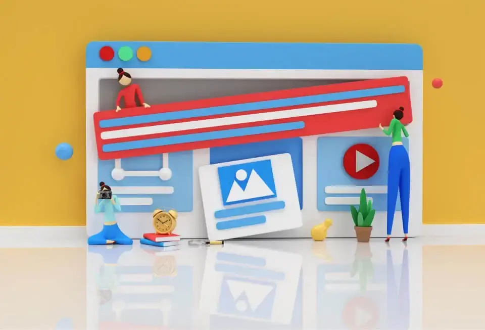
Key Elements of a Good Landing Page: Tips & Tricks
A good landing page is all about keeping it simple, focused, and action-driven. The right elements can turn visitors into leads and make all the difference in your conversions. Here are the key elements of a great landing page.
1. Engaging Headline
The headline is the first thing a visitor sees when they land on your page, and it plays a critical role in capturing their attention. An attention-grabbing headline can make all the difference in whether a visitor explores your page or leaves to check out another site. Here are some key elements and tips for crafting an effective landing page headline:
- Clarity Over Cleverness
While it may be tempting to create a witty or overly clever headline, clarity is far more important. Your headline should immediately communicate the core message or benefit of your offer. Visitors should instantly understand what your page is about and why they should care. A clear headline helps set expectations and guides visitors towards the desired action.
Example: Instead of a headline like "Unlock the Future," which is vague, consider a more specific headline like "Boost Your Productivity with Our Project Management Software."
- Keep It Short and Sweet
A good landing page headline is concise and to the point. You want to grab your visitors' attention quickly, so aim for headlines that are around 10-15 words or fewer. The goal is to convey your main message in a way that's easy to digest in just a glance.
- Highlight the Main Benefit or Solution
The headline should speak directly to the visitor's needs or pain points. Think about the primary benefit that your product, service, or offer provides, and make that the focal point of your headline. This way, visitors can immediately see the value in what you're offering.
Example: "Save 10 Hours a Week on Email with Our Automated Tool" clearly emphasises the benefit of time-saving.
- Create a Sense of Urgency or Curiosity (When Appropriate)
If your offer is time-sensitive or you want to spark curiosity, incorporate urgency or intrigue into your headline. This can encourage visitors to take action immediately rather than leaving the page and possibly forgetting about it later.
Example: "Limited Time Offer: Get 50% Off Your First Month!"
2. Concise and Persuasive Copy
Once you’ve hooked your visitors with a strong headline, the next step is to keep them engaged with persuasive copy. The content on your landing page should be concise compelling, and lead the visitor toward taking the desired action without overwhelming them with information. Here are some essential tips for writing landing page copy that converts:
- Keep It Short and Relevant
Landing page visitors typically have short attention spans, so it’s crucial to communicate your message quickly. Focus on short sentences and paragraphs that highlight the key benefits of your offer. Avoid fluff and unnecessary jargon—make sure every word serves a purpose. Keep in mind that you want to encourage the visitor to take action without making them read through large blocks of text.
- Highlight the Benefits, Not Just Features
While it’s important to explain what your product or service does, visitors are often more interested in how it benefits them. Instead of simply listing features, highlight the positive outcomes and advantages they’ll gain by using your product. Show them how it can make their life easier, solve a problem, or improve their current situation.
Example: Instead of saying, "Our software has real-time collaboration features," focus on the benefit: "Collaborate with your team in real-time to get projects done faster."
- Use Simple, Conversational Language
Make sure your landing page copy is simple and speaks directly to your audience. Use everyday language that feels personal and relevant, creating a connection with each visitor. Steer clear of overly formal or technical terms unless your audience widely knows them.
Example: Instead of "Our product maximises efficiency," try "Get more done in less time."
- Create a Connection with Your Audience
Effective copy speaks directly to your audience’s pain points and aspirations. Use "you" language to personalise the message and make the visitor feel that the content is directed toward them. Understand your audience’s challenges, and then frame your offer as the solution they’ve been searching for.
Example: "Are you tired of wasting hours on tedious tasks? Our tool helps you reclaim your time."
- Include Actionable Language
Using actionable language helps motivate visitors to take the next step. Phrases like “Get Started,” “Boost Your Productivity,” or “Claim Your Discount” work well to create momentum. Make sure your copy reflects a sense of progress and guides the visitor smoothly to the CTA.
- Be Consistent Throughout the Page
Ensure your copy aligns with the headline and the CTA. All elements of your landing page should work cohesively to drive the visitor toward the same goal. A unified tone, message, and benefits ensure that visitors can smoothly follow the flow and clearly comprehend the offer.
3. Clear Call-to-Action (CTA)
The call-to-action (CTA) is the driving force behind your landing page. It’s the point at which visitors either convert into leads or customers or leave without taking action. A well-crafted CTA can make all the difference, so let’s explore how to make yours stand out and drive conversions.
- Make the CTA Stand Out Visually
Your CTA button should be instantly noticeable. Use contrasting colours, bold fonts, and plenty of white space around it to draw attention. The goal is for the visitor to know exactly where to click without having to search for the action button. Ensure it stands out from the rest of the page and grabs their attention.
- Use Action-Oriented Language
The text on your CTA button should be action-oriented, encouraging visitors to take the next step. Phrases like "Get Started Now," "Download Your Free Guide," or "Sign Up Today" motivate users to act quickly. Avoid generic terms like "Submit" or "Click Here" and instead focus on what the visitor will receive or achieve by clicking.
Example: If you're offering a free trial, a CTA like "Start Your Free Trial Now" is much more enticing than just "Submit."
- Create a Sense of Urgency
Adding urgency to your CTA can encourage visitors to take immediate action. Words and phrases like "Limited Time Offer," "Act Fast," or "Only a Few Spots Left" can create a fear of missing out (FOMO) and push visitors to act quickly. However, use urgency sparingly and genuinely, as overdoing it can reduce credibility.
- Position the CTA Strategically
Place your CTA where it’s easily accessible. In most cases, it should be “above the fold,” meaning visitors don’t have to scroll to see it. However, on longer landing pages, consider adding multiple CTA buttons, especially near key points where visitors might be ready to act (e.g., after testimonials or key benefits).
- Align the CTA with the Page Goal
Your CTA should reflect the primary purpose of your landing page. Whether you're encouraging visitors to download an e-book, start a free trial, or book a demo, make sure the CTA text aligns perfectly with the action you want them to take. It should be clear what happens when they click the button.
- Keep the Form Simple (if Applicable)
If your CTA requires filling out a form, make sure the form is short and easy to complete. Ask for only the essential information you need. A long-form can be a deterrent, so keep it to a minimum—often, just an email address is enough to start the relationship.
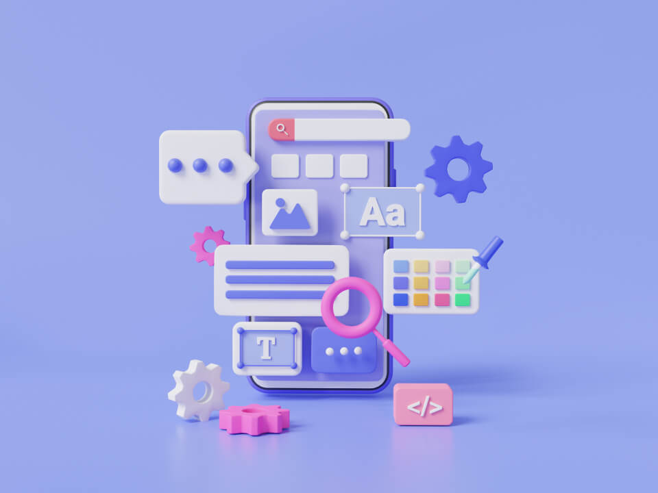
4. Eye-Catching Visuals
Visuals are powerful tools on a landing page. They not only grab attention but also help convey your message quickly and make your offer more appealing. High-quality visuals can enhance your content and play a significant role in guiding visitors toward conversion. Here’s how to make the most of your landing page visuals:
- Choose Relevant and High-Quality Images
Use images that are directly related to your offer and visually represent the benefits or product. High-quality, professional images build trust and make your landing page look polished. Avoid generic stock photos that don’t add value or context to your content—they can make your page seem impersonal.
Example: If you're promoting an online course, use an image of a person engaging in the course on a computer or a sneak peek of the course material.
- Use Videos to Increase Engagement
Videos are an excellent way to engage visitors and communicate your message quickly. A short video that explains your offer provides a demo, or showcases customer testimonials can significantly boost conversions. Ensure that the video is concise and directly supports your landing page goal.
Tip: Use an autoplay video with a mute setting to grab attention or have an easily accessible play button that invites visitors to click.
- Highlight the Benefits with Visual Elements
Visual elements like icons, infographics, or illustrations can help visitors quickly understand the key benefits of your offer. Use visuals to break down information into digestible sections or highlight important points so visitors can scan and grasp the core message easily.
Example: If your landing page promotes an app, use icons to represent each feature, paired with brief descriptions to make the content visually scannable.
- Leverage Customer Testimonials and Social Proof
Including visuals of happy customers, client logos, or awards received is a great way to build trust. Images of real people using your product or service can help potential customers imagine themselves in their place, boosting their likelihood of conversion. Authenticity is key here—real photos of customers are much more impactful than overly polished stock photos.
- Ensure Visuals Don’t Distract from the CTA
While visuals should be engaging, they shouldn’t distract visitors from the main goal of the page—converting through the CTA. Make sure your images, videos, or graphics support the copy and CTA rather than drawing attention away from it. All visuals should be strategically placed to guide the visitor's eye toward the action you want them to take.
- Optimise for Speed and Mobile Devices
Large, unoptimised visuals can slow down your page load time, which can lead to higher bounce rates. Ensure all images and videos are compressed for faster loading without compromising quality. Additionally, your visuals should be responsive, adapting well to different screen sizes for a seamless mobile experience.
5. Trust Indicators and Social Proof
Building trust is essential for any landing page to succeed. Visitors need to feel confident in your offer and brand before they’ll convert. Trust indicators and social proof—like testimonials, customer reviews, or industry accolades—help establish your credibility and encourage visitors to take the next step. Here’s how you can incorporate them effectively
- Customer Testimonials
Use specific quotes from satisfied customers, ideally with their name and photo, to highlight benefits and build authenticity.
- Display Ratings and Reviews
Showcase star ratings and reviews from platforms like Google or Trustpilot to provide instant social proof and increase confidence.
- Trust Badges and Certifications
Feature badges like “Secure Checkout,” “Money-Back Guarantee,” or security certifications to reassure visitors that their information is safe.
- Customer Success Stories
Include brief, data-driven case studies or success stories that show how your product or service delivered results for real customers.
- Client Logos and Partnerships
Highlight logos of well-known clients or partners to leverage their credibility and show that recognisable names trust your product.
- Awards and Accolades
Display any industry awards or recognitions to boost your brand’s credibility and make visitors feel confident in choosing you.
6. Easy Navigation and Layout
A landing page's design should create a seamless experience for visitors. A clean layout and simple navigation keep users focused on the key message and encourage conversions. Here’s how to achieve that:
- Keep It Simple
Simplicity is key. A clutter-free layout directs attention to the main goal, ensuring visitors don’t get distracted by unnecessary elements. Highlight the main message, benefits, and CTA without overwhelming the page.
- Make It Mobile-Friendly
Ensure your landing page looks great and functions well on all devices. A mobile-responsive design is essential since a large portion of traffic comes from mobile users. Make sure buttons, images, and text scale appropriately for different screens.
- Highlight the CTA and Important Information
Place your CTA above the fold so visitors don’t need to scroll to find it. The most important information should be immediately visible, guiding users toward the next action as soon as they land.
- Use White Space Wisely
White space (or negative space) improves readability and focuses attention on key elements. It gives your landing page a clean, organised look and ensures that your visuals and text are easily digestible.
- Maintain Consistent Branding
Your landing page design should match your brand’s overall look and feel. Consistent use of fonts, colours, and logos helps reinforce brand identity and creates a cohesive experience across all your marketing efforts.
- Ensure Quick Load Time
Page speed is crucial for retaining visitors. Optimise images and scripts to ensure your landing page loads quickly. A slow-loading page can lead to higher bounce rates and lost conversions.
7. Compelling Lead Capture Form
A well-designed lead capture form is essential for gathering visitor information without deterring them from converting. Here are some key tips to make your form effective:
- Keep It Short and Simple
The shorter the form, the more likely visitors are to complete it. Request only essential information, such as a name and email address. Asking for too much upfront can overwhelm visitors and reduce your chances of capturing their details.
- Clear and Actionable Headline
The headline of your form should clearly explain what visitors will get by completing it. Make it benefit-oriented so users understand why it’s worth their time to provide their information.
- Single, Clear Call-to-Action (CTA)
Your form's CTA button should be straightforward and action-driven, such as "Get Your Free Guide" or "Start Your Free Trial." Use a contrasting colour to make the button stand out, guiding visitors to click.
- Position the Form Wisely
The lead capture form should be positioned strategically on your landing page. If it’s the primary action, place it above the fold for easy visibility. On longer landing pages, include it after the key benefits and information are shared.
- Ensure Easy Completion
Make sure your form fields are user-friendly and easy to complete. Use clear labels, pre-filled hints, and an accessible design that works seamlessly across all devices. Minimise effort and friction for the visitor.
- Highlight the Benefits and Value
Let visitors know what they’re getting in return for providing their information. Whether it’s access to exclusive content, a free demo, or a special discount, be clear about the value and motivate them to take action.
8. Highlight Unique Selling Proposition (USP)
Your Unique Selling Proposition (USP) is what sets you apart from competitors. It's the compelling reason why visitors should choose your product or service. Here’s how to effectively highlight your USP on a landing page, with some examples and tips to guide you:
- Clearly Communicate What Makes You Different
Identify and emphasise what makes your product or service unique. Whether it’s unmatched quality, an exclusive feature, or exceptional customer support, make sure it’s communicated clearly. Visitors should immediately understand why your offer is superior.
Example: If you're offering faster shipping than competitors, a USP like “Same-Day Delivery, Guaranteed” quickly tells visitors what sets you apart.
- Emphasise the Benefits Of Features
While features are important, benefits are what truly resonate with visitors. Focus on how your product or service will make their life easier, solve a problem, or deliver better results. Benefits create an emotional connection and make your USP more compelling.
Tip: Instead of saying, “Our app tracks expenses in real-time,” highlight the benefit: “Take control of your finances and save money with real-time expense tracking.”
- Use Bullet Points for Quick Readability
Breaking down your USP into bullet points helps visitors quickly scan and grasp your key benefits. This format is especially useful for visitors who prefer to skim content, making it easy to see the advantages without having to dig deep into the copy.
Example: 24/7 Customer Support, Easy 5-Minute Setup, No Hidden Fees, Ever
- Incorporate Supporting Visuals
Pair your USP with visuals like product images, infographics, or short videos that highlight the benefits. Visuals not only make your landing page more appealing but also help reinforce your USP by showing rather than just telling.
Tip: If you’re promoting a skincare product with all-natural ingredients, use high-quality images of the ingredients along with captions like “Made with Aloe Vera for Instant Hydration.”
- Keep Your Message Consistent Throughout
Ensure your USP aligns with the headline, body copy, and CTA of your landing page. A consistent message throughout the page helps build a compelling case and reinforces your offer, leaving no room for confusion about your unique value.
Tip: If your headline promises “Boost Your Productivity by 50%,” make sure that your copy, visuals, and CTA (“Get Started with a 30-Day Free Trial”) all support this benefit.
9. Strong Value Proposition
A strong value proposition clearly articulates the benefits of your product or service and why it’s the best choice for your target audience. It's a powerful statement that resonates with your visitors, addresses their needs, and motivates them to take action. Here’s how to craft and present an effective value proposition on your landing page:
- Focus on the Customer's Pain Points
Understand the challenges your audience faces and position your value proposition as the solution. Address their needs directly, showing how your product or service alleviates their pain points or makes life easier.
Example: For a task management tool, you might say, “Eliminate missed deadlines and stay organised effortlessly.”
- Highlight the Core Benefits
Clearly explain the top benefits visitors will gain by using your product. While features are helpful, visitors want to know how your product will improve their situation or solve their problems. Keep the benefits specific and impactful.
Tip: Instead of "Our software offers advanced reporting features," reframe it as "Make data-driven decisions with easy-to-read, real-time reports."
- Keep It Short and Memorable
Your value proposition should be simple, concise, and easy to remember. A sentence or short paragraph that sums up what your product does and the benefits it provides is ideal. Visitors should be able to understand your offer and why it matters within seconds.
Example: “Get fit in just 20 minutes a day with our easy-to-follow workout app.”
- Use Supporting Subheadings for Clarity
If you need more space to explain the benefits, use subheadings to elaborate on the value proposition without overwhelming the visitor. A subheading can provide additional context or reinforce the main message.
Tip: A value proposition like “Secure Your Data with Our Encrypted Cloud Storage” could be paired with a subheading like “Fast, reliable, and 100% secure storage for all your personal and professional files.”
- Incorporate Visual Proof to Reinforce the Value
Pair your value proposition with visuals that reinforce the benefits. Use screenshots, photos, or videos to show the product in action, demonstrate its impact, or showcase a real-life scenario that speaks to the visitor’s needs.
Example: A meal delivery service could include a photo of a prepared meal with a caption like, “Fresh, chef-crafted meals delivered to your door—ready to eat in minutes.”
- Speak to Your Target Audience’s Emotions
Tap into the emotional side of your audience. Highlight how they’ll feel after using your product—whether it’s a relief, happiness, confidence, or ease. An emotional connection makes your value proposition more compelling.
Tip: “Feel at ease knowing your family is protected with our comprehensive home security system.”
10. A/B Testing and Optimisation
Designing a landing page is the initial step, but the real work lies in fine-tuning it for optimal conversions. Through A/B testing and optimisation, you can compare different page versions to understand which resonates most effectively with your visitors. Here’s how to make the most of A/B testing for a more effective landing page:
- Test One Element at a Time
When running an A/B test, change only one element per test—such as the headline, CTA colour, or imagery. This makes it easier to pinpoint exactly what drives higher conversions. Testing multiple elements simultaneously can lead to unclear results.
Example: Try testing two different headlines: “Boost Your Productivity by 50%” vs. “Save 5 Hours a Week with Our Tool.”
- Use Data to Guide Your Tests
Use analytics tools to determine which elements of your landing page might need improvement. Metrics like bounce rate, time spent on a page, and conversion rate can give you insights into which areas of the page are underperforming and should be prioritised for testing.
Tip: If you notice visitors drop off before filling out your form, consider testing a shorter version of the form or a different placement for your CTA.
- Test All Crucial Elements of the Page
Focus on testing high-impact elements that influence conversions the most. These include the headline, CTA, imagery, form fields, and even colours. A small tweak to a key element can often result in a significant increase in conversions.
Example: Experiment with different CTA button texts like "Get My Free Trial" vs. "Start Saving Time Now" to see which drives more clicks.
- Monitor the Results and Set a Time Frame
A/B tests need to run long enough to gather statistically significant data. Don’t rush to conclusions based on limited traffic. Set a specific time frame or until a certain number of visitors have interacted with the page to ensure reliable results.
Tip: Tools like Google Optimise or Optimizely can help you track and analyse your test results more effectively.
- Optimise Based on Insights
Once you have a winner from your A/B test, implement the change and monitor how it impacts your overall conversion rate. Continue testing other elements to consistently improve performance. Optimisation is a continuous process, so keep experimenting to find the best combination.
Why HubSpot is Ideal for Building High-Converting Landing Pages?
When it comes to creating landing pages that drive conversions, HubSpot offers an all-in-one platform that simplifies the process of creating and optimising landing pages for maximum conversions. Here's why it's an excellent choice:
- Drag-and-Drop Builder: HubSpot’s intuitive interface allows you to design professional landing pages without the need for coding, making the creation process faster and more accessible.
- CRM Integration: HubSpot's landing pages are seamlessly connected to its CRM, allowing for real-time tracking of leads and enhanced personalisation.
- A/B Testing: HubSpot offers built-in A/B testing capabilities, enabling you to test different variations of your landing page and optimise for higher conversions.
- SEO and Analytics: The platform includes tools for SEO optimisation, ensuring your pages are visible in search results, and provides detailed analytics to measure performance and adjust accordingly.
- Mobile Optimisation: All HubSpot landing pages are automatically responsive, ensuring they look great and perform well on any device.
By leveraging HubSpot’s powerful tools, you can create landing pages that are not only visually appealing but also optimised for lead generation and conversion.
Get Tailored, High-Converting HubSpot Landing Pages with ScaleStation
Creating a landing page that converts is an art—and sometimes, you need the right expertise to get it just right. That’s where ScaleStation comes in. Our team specialises in building compelling, results-driven landing pages tailored to your business goals. From attention-grabbing headlines to optimised forms and A/B testing, we make sure every element of your landing page is designed to convert visitors into leads or customers.
Ready to elevate your landing page game? Get in touch with ScaleStation today, and let’s craft a landing page that not only looks amazing but delivers real results.
Conclusion
Crafting a high-converting landing page involves a careful mix of design, messaging, and user experience. Each component is vital for encouraging action, whether it’s a headline that hooks the reader, brief yet impactful copy that resonates with their needs, or a strong CTA that drives them toward conversion.
Using compelling visuals, establishing credibility with social proof, showcasing your USP and value proposition, and regularly A/B testing for optimisation are all crucial steps to crafting a landing page that effectively draws in visitors and converts them into leads or customers.
Remember, the most effective landing pages are those that are continuously refined based on data and user behaviour. Keep experimenting, testing, and tweaking to find what resonates best with your audience, and you'll see your conversion rates improve over time.
.webp)

